After learning about Python fundamentals and basics about working with data, it is time to start with more exciting parts of this Python for SQL Server Specialists series.
In this article you will learn about the most important libraries for advanced graphing, namely matplotlib and seaborn, and about the most popular data science library, the scikit-learn library.
Creating Graphs
You will learn how to do graphs with two Python libraries: matplotlib and seaborn. Matplotlib is a mature well-tested, and cross-platform graphics engine. In order to work with it, you need to import it. However, you need also to import an interface to it. Matplotlib is the whole library, and matplotlib.pyplot is a module in matplotlib. Pyplot as the interface to the underlying plotting library that knows how automatically create the figure and axes and other necessary elements to create the desired plot. Seaborn is a visualization library built on matplotlib, adding additional enhanced graphing options, and making work with pandas data frames easy.
Anyway, without further talking, let’s start developing. First, let’s import all necessary packages for this section.
import numpy as np
import pandas as pd
import matplotlib as mpl
import matplotlib.pyplot as plt
import seaborn as sns
The next step is to create sample data. An array of 100 evenly distributed numbers between 0 and 10 is the data for the independent variable, and then the following code creates two dependent variables, one as the sinus of the independent one, and the second as the natural logarithm of the independent one.
# Creating data and functions
x = np.linspace(0.1, 10, 100)
y = np.sin(x)
z = np.log(x)
The following code defines the style to use for the graph and then plots two lines, one for each function. The plt.show() command is needed to show the graph interactively.
# Basic graph
plt.style.use('classic')
plt.plot(x, y)
plt.plot(x, z)
plt.show()
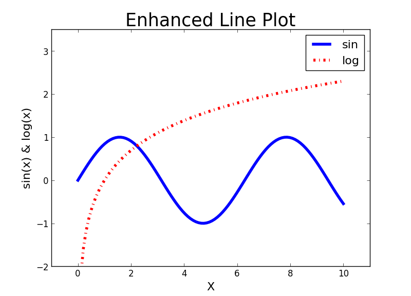
If you execute the code above in Visual Studio 2017, you should get a pop-up window with the desired graph. I am not showing the graph yet; before showing it, I want to make some enhancements and besides showing it also save it to a file. The following code uses the plt.figure() function to create an object that will store the graph. Then for each function defines the line style, line width, line color, and label. The plt.axis() line redefines the axes range. The next three lines define the axes titles and the title of the graph and define font size for the text. The plt.legend() line draws the legend. The last two lines show the graph interactively and save it to a file.
# Enhanced graph
f = plt.figure()
plt.plot(x, y, color = 'blue', linestyle = 'solid',
         linewidth = 4, label = 'sin')
plt.plot(x, z, color = 'red', linestyle = 'dashdot',
         linewidth = 4, label = 'log')
plt.axis([-1, 11, -2, 3.5])
plt.xlabel("X", fontsize = 16)
plt.ylabel("sin(x) & log(x)", fontsize = 16)
plt.title("Enhanced Line Plot", fontsize = 25)
plt.legend(fontsize = 16)
plt.show()
f.savefig('C:\\PythonSolidQ\\SinLog.png')
Here is the result of the code above – the first nice graph.
Graphing SQL Server Data
Now it’s time to switch to some more realistic examples. First, let’s import the dbo.vTargetMail data from the AdventureWorksDW2016 demo database in a pandas data frame.
# Connecting and reading the data
import pyodbc
con = pyodbc.connect('DSN=AWDW;UID=RUser;PWD=Pa$$w0rd')
query = """SELECT CustomerKey,
             TotalChildren, NumberChildrenAtHome,
             HouseOwnerFlag, NumberCarsOwned,
             EnglishEducation as Education,
             YearlyIncome, Age, BikeBuyer
           FROM dbo.vTargetMail;"""
TM = pd.read_sql(query, con)
The next graph you can create is a scatterplot. The following code plots YearlyIncome over Age. Note that the code creates a smaller data frame with first hundred rows only, in order to get less cluttered graph for the demo. Again, for the sake of brevity, I am not showing this graph.
# Scatterplot
TM1 = TM.head(100)
plt.scatter(TM1['Age'], TM1['YearlyIncome'])
plt.xlabel("Age", fontsize = 16)
plt.ylabel("YearlyIncome", fontsize = 16)
plt.title("YearlyIncome over Age", fontsize = 25)
plt.show()
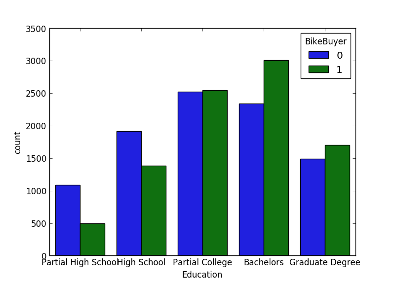
For categorical variables, you usually create bar charts for a quick overview of the distribution. You can do it with the countplot() function from the seaborn package. Let’s try to plot counts for the BikeBuyer variable in the classes of the Education variable.
# Bar chart
sns.countplot(x="Education", hue="BikeBuyer", data=TM);
plt.show()
# Note the wrong order of Education
If you executed the previous code, you should have noticed that the Education variable is not sorted correctly. You need to inform Python about the intrinsic order of a categorial or nominal variable. The following code defines that the Education variable is categorical and then shows the categories,
# Define Education as categorical
TM['Education'] = TM['Education'].astype('category')
TM['Education']
In the next step, the code defines the correct order.
 # Proper order
TM['Education'].cat.reorder_categories(
    ["Partial High School",
     "High School","Partial College",
     "Bachelors", "Graduate Degree"], inplace=True)
Now it is time to create the bar chart again. This time, I am also saving it to a file, and showing it here.
# Correct graph
f = plt.figure()
sns.countplot(x="Education", hue="BikeBuyer", data=TM);
plt.show()
f.savefig('C:\\PythonSolidQ\\EducationBikeBuyer.png')
So here is the bar chart.
Machine Learning with Scikit-Learn
You can find many different libraries for statistics, data mining and machine learning in Python. Probably the best-known one is the scikit-learn package. It provides most of the commonly used algorithms, and also tools for data preparation and model evaluation.
In scikit-learn, you work with data in a tabular representation by using pandas data frames. The input table (actually a two-dimensional array, not a table in the relational sense) has columns used to train the model. Columns, or attributes, represent some features, and therefore this table is also called the features matrix. There is no prescribed naming convention; however, in most of the Python code, you will note that this features matrix is stored in variable X.
If you have a directed, or supervised algorithm, then you also need the target variable. This is represented as a vector or one-dimensional target array. Commonly, this target array is stored in a variable named y.
Without further hesitation, let’s create some mining models. First, the following code imports all necessary libraries for this section.
# sklear imports
from sklearn.model_selection import train_test_split
from sklearn.metrics import accuracy_score
from sklearn.naive_bayes import GaussianNB
from sklearn.mixture import GaussianMixture
Next step is to prepare the features matrix and the target array. The following code also checks the shape of both.
# Preparing the data for Naive Bayes
X = TM[['TotalChildren', 'NumberChildrenAtHome',
        'HouseOwnerFlag', 'NumberCarsOwned',
        'YearlyIncome', 'Age']]
X.shape
y = TM['BikeBuyer']
y.shape
The first model will be a supervised one, using the Naïve Bayes classification. For testing the accuracy of the model, you need to split the data into the training and the test set. You can use the train_test_split() function from the scikit-learn library for this task.
# Split to the treining and test sets
Xtrain, Xtest, ytrain, ytest = train_test_split(
    X, y, random_state = 0, train_size = 0.7)
Note that the code above puts 70% of the data into the training set and 30% into the test set. The next step is to initialize and train the model with the training data set.
# Initialize and train the model
model = GaussianNB()
model.fit(Xtrain, ytrain)
That’s it. The model is prepared and trained. You can start using it for making predictions. You can use the test set for predictions and evaluate the model. A very well-known measure is the accuracy. The accuracy is the proportion of the total number of predictions that were correct, defined as the sum of true positive and true negative predictions with the total number of cases predicted. The following code uses the test set for the predictions and then measures the accuracy.
# Predictions and accuracy
ymodel = model.predict(Xtest)
accuracy_score(ytest, ymodel)
You can see that you can do quite advanced analyses with just few lines of code. Let’s make another model, this time an undirected one, using the clustering algorithm. For this one, you don’t need training and test sets, and also not the target array. The only thing you need to prepare is the features matrix.
# Preparing the data for Clustering
X = TM[['TotalChildren', 'NumberChildrenAtHome',
        'HouseOwnerFlag', 'NumberCarsOwned',
        'YearlyIncome', 'Age', 'BikeBuyer']]
Again, you need to initialize and fit the model. Note the following code tries to group cases in two clusters.
# Initialize and train the model
model = GaussianMixture(n_components = 2, covariance_type = 'full')
model.fit(X)
The predict() function for the clustering model creates the cluster information for each case in the form of a resulting vector. The following code creates this vector and shows it.
# Predictions
ymodel = model.predict(X)
ymodel
You can add the cluster information to the input feature matrix.
# Add the cluster membership to the source data
X['Cluster'] = ymodel
X.head()
Now you need to understand the clusters. You can get this understanding graphically. The following code shows how you can use the seaborn lmplot() function to create scatterplot showing the cluster membership of the cases spread over income and age.
# Analyze the clusters
sns.set(font_scale = 3)
lm = sns.lmplot(x = 'YearlyIncome', y = 'Age',
                hue = 'Cluster',  markers = ['o', 'x'],
                palette = ["orange", "blue"], scatter_kws={"s": 200},
                data = X, fit_reg = False,
                sharex = False, legend = True)
axes = lm.axes
axes[0,0].set_xlim(0, 190000)
plt.show(lm)
The following figure shows the result. You can see that in cluster 0 there are older people with less income, while cluster 1 consists of younger people, with not so distinctively higher income only.

Conclusion
Now this was something, right? With couple of lines of code, we succeeded to create very nice graphs and perform quite advanced analyses. We analyzed SQL Server data. However, we did not use neither the scalable Microsoft machine learning libraries nor Python code inside SQL Server yet. Stay tuned – this is left for the last article in this series.
Read the whole series:
Python for SQL Server Specialists Part 1: Introducing Python
Python for SQL Server Specialists Part 2: Working with Data
Python for SQL Server Specialists Part 4: Python and SQL Server
This is just an introduction, for more on starting with data science in SQL Server please refer to the book “Data Science with SQL Server Quick Start Guide” (https://www.packtpub.com/big-data-and-business-intelligence/data-science-sql-server-quick-start-guide), where you will learn about tools and methods not just in Python, but also R and T-SQL.
