
By Lorenzo Vercellati, Power BI Solution Architect at Lucient
After the theory, it is time to look at Power BI and understand the best way to apply the rules for data storytelling and visualization we spoke about in the first post of this series.
Power BI has over 37 default visuals and more than 100 custom visuals. Do not feel forced to try all: they are just choices. If you are interested in getting to know them better, here is a classification of them all.
No more pie charts
The pie chart is one of the most used visuals in the world. When a new customer or a Power BI developer shares his work with me for the first time, I am almost 100% confident the first page will feature a pie chart (or the second one if I am lucky!).
Let me say just one thing about pie charts: leave them to those who can get something out of them. Why? Because the pie chart does not offer a clear visual. Whenever we manage more than three categories differences are not as easy to spot immediately.
- Too many colors are needed (one per category).
- It is best if you have labels and a legend to make it clear.
- Too much stuff for just one visual.
(This also applies to the donut chart.)
There is only one situation where a pie chart is useful: when you need to evidence a part versus the total—like in a drill-through page.
Categorical charts
As explained in the Cleveland-McGill scale, the best type of charts are the categorical ones—bar and column.
Bar graphs are specifically created to display multiple rather than single instances of a measure. They work perfectly for displaying measures associated with discrete items in a category, such as various regions or products.

Do not use line graphs with categorical data! A line means continuity between points, and categorical data has no continuity. Also, bar and column charts are useful because you do not need a lot of colors, and you may easily discern which category is bigger than others without labels (although they are not forbidden!).
Moreover, in both chart types, colors can add more information, although this is more an opportunity than a need.

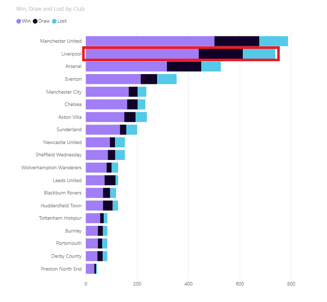
Another good choice for categorical data is the stacked chart. Nonetheless, it should be used with caution, as it may work as a good comparison tool for the first series (that nearest to the X-axis), but it can prove difficult for understanding the real length of the others.
All three types are a good choice to display multiple instances of a whole and its parts, emphasizing the whole.
If you think of the Cleveland-McGill scale, it becomes clearer. The full chart belongs to the first category of the scale, and the single series, save the bar, to the third.
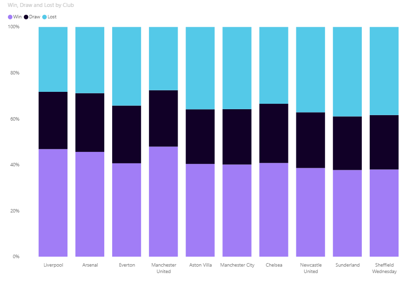
The same reasoning can be applied to a fully stacked chart. However, this type is not as useful as the standard stacked chart because it lacks length properties (by definition, the length is the same for all categories).
Time Series
My advice here is always to use lines. Why? Because time series are sequences of events, and lines are a sequence of points by their very definition.
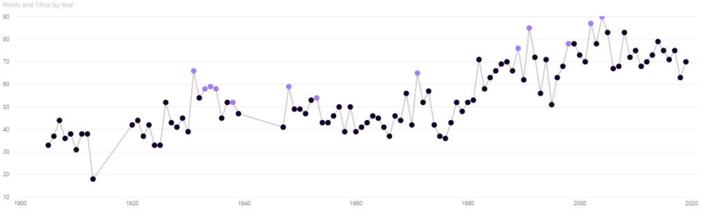
You may want to stress some points of the line. In that case, to make your fact more evident, transform the line chart into a column chart and give each column a different color.
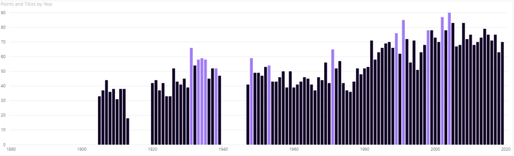
Warning! Do not try this with a bar chart because time flows from left to right, not from top to bottom.
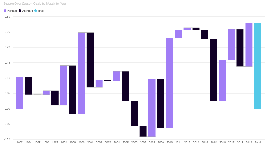
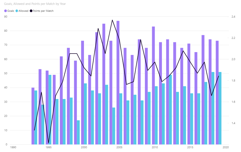
Other charts that can be used for time series are the Waterfall and Combo. However, my suggestion is always to verify that your visual is readable and adequately conveys the information. A Combo chart may be required to be split in two—if you have space—to improve readability.
Remember that different series within the same chart could suggest a correlation. In that case, make sure that correlation is real; otherwise, it is more convenient to present the series separately.
Scatterplot
When you are working to show relationships between different measures, the scatterplot chart is what you should be looking for. A visual that evidences the relationship between two measures in the most natural way: their position on a cartesian diagram.
If a bubble is at a top-right position, both measures are showing good performance. While if they are at the bottom right, only the X-axis measure is good, and so on.
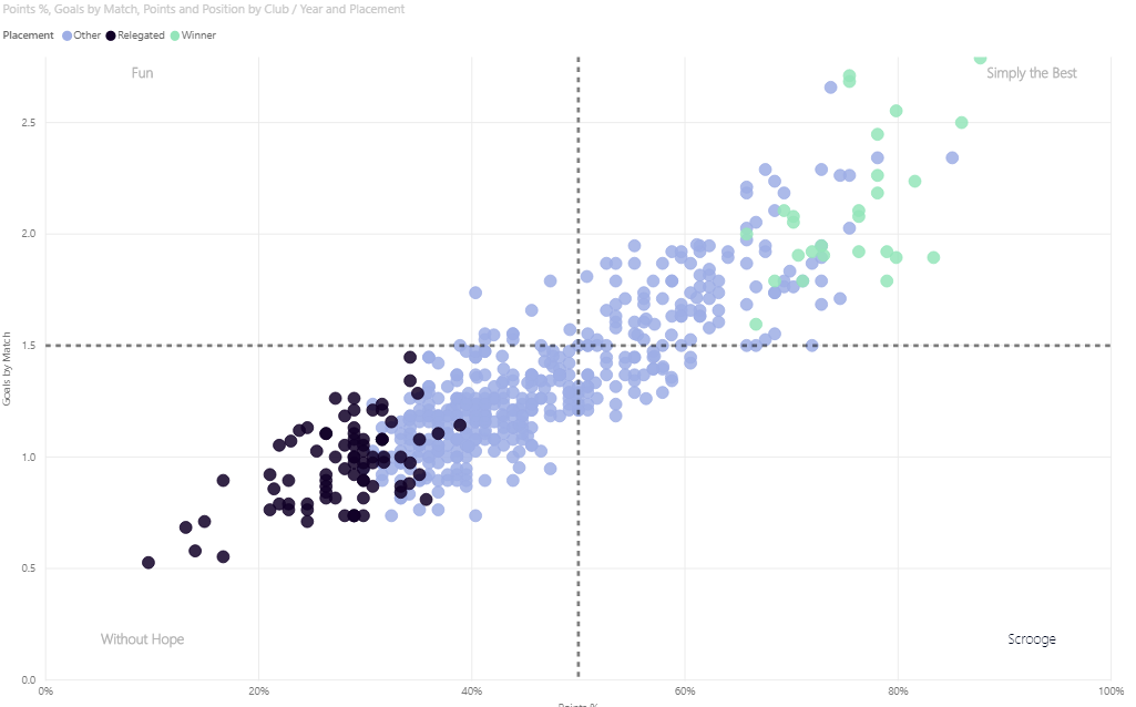
Quite frequently, customers tell me this chart may be too difficult to understand for their stakeholders. I think the simpleness of a scatterplot provides a clearer vision. No labels or axis names are necessary to understand which bubble is better performing than others.
Should you want to include a size category in a scatterplot chart, you must be careful. It may create confusion and mislead. Let us assume we have two overlapping bubbles, one gray and a larger yellow one. If I tell you that the gray bubble’s value is 7, what is the yellow one’s? Most people will answer around 10. Instead, the correct answer is 13! Almost double! Incredible, right?
Tables & Matrices
“Ok, your reports are fine, but could I please have my three hundred thousand rows and twenty column table, please?” Sincerely, who has never been asked this question? Beware: tables and matrixes are the cause of death of 95% of data visualization projects!
Remember: your users can always visualize the data behind visuals or explore the model with an Excel sheet, so what is the point in crafting a report full of tables? It makes no sense for data storytelling purposes!
Use a table only when it is mandatory and without too many columns or rows. And please make sure the relevant information is clearly displayed!
Custom Visuals
Power BI Visual marketplace offers more than one hundred visuals. Why should we not make good use of them for data storytelling and visualization? Before doing so, think about the following points:
- Use them only if you are sure that you need something that default visuals cannot give you.
- Is there any way you can get the desired effect by resorting to the default visual properties?
All custom visuals do not support some features: for example, drill-through or labels.
The frequency of updates must be observed. While Power BI is updated monthly, custom visuals updates may require waiting a few days… or much longer.
Colors
We have already determined that colors can be a great asset to our data storytelling. Spoiler alert: some rules are to be observed if we want them to function effectively.
Colors must always have a distinct meaning in a report. Say you use green for positive data and red for negative data. Mind color consistency! Be sure to use the same color for the same category in ALL visuals on ALL pages.
If you do not have a color palette prepared by your marketing team, you can always use some basic color rules. Not feeling confident about how to do this? Hit the net, and you will find a lot of interesting sources to guide you through it.
Final recap
There could be an endless flow of tips and tricks about data storytelling and visualization, but I would like you to focus on the best solution for what you intend to show. Never stop at the first solution that comes to your mind, or at the one that seems most logical to you.
Always evaluate possible alternatives and choose the one that gives you more with less. You may need to add or remove a few pieces, but experimenting a bit always delivers solid answers. With some practice, you will master transforming visuals.
Do not be afraid to remove all non-relevant information from your report. The main goal must be keeping it simple and clear. A report works like a joke: If you need to explain it, it is a bad one.
One final tip: “Perfection is not when you have nothing else to add, but when you have nothing to take away.”
Bibliography
- Alberto Cairo, The Truthful Art
- Alberto Cairo, The Functional Art
- Cole Nussbaumer Knaflic, Storytelling with Data
- Stephen Few, Information Dashboard Design
- Stephen Few, The Data Loom: Weaving Understanding by Thinking Critically and Scientifically with Data
